Spark, the popular email app from Readdle, has gotten a pretty big update, and with it, they’re switching to a subscription model. If you’re a user today, nothing much will change, unless you want access to these new features. It’s all detailed in a blog post, but I wanted to touch this a bit.
First, the new subscription model pricing. We’re looking at $8/month or $60/year for individual users, which, I must say, is pretty steep. Current users get 30% off. The Spark for teams pricing is, I think, unchanged, at $10/month or $84/year per user. Again, pretty steep, but if you build your business around email, and need collaborative tools and real-time chat about these things, then it’s reasonable, I guess.
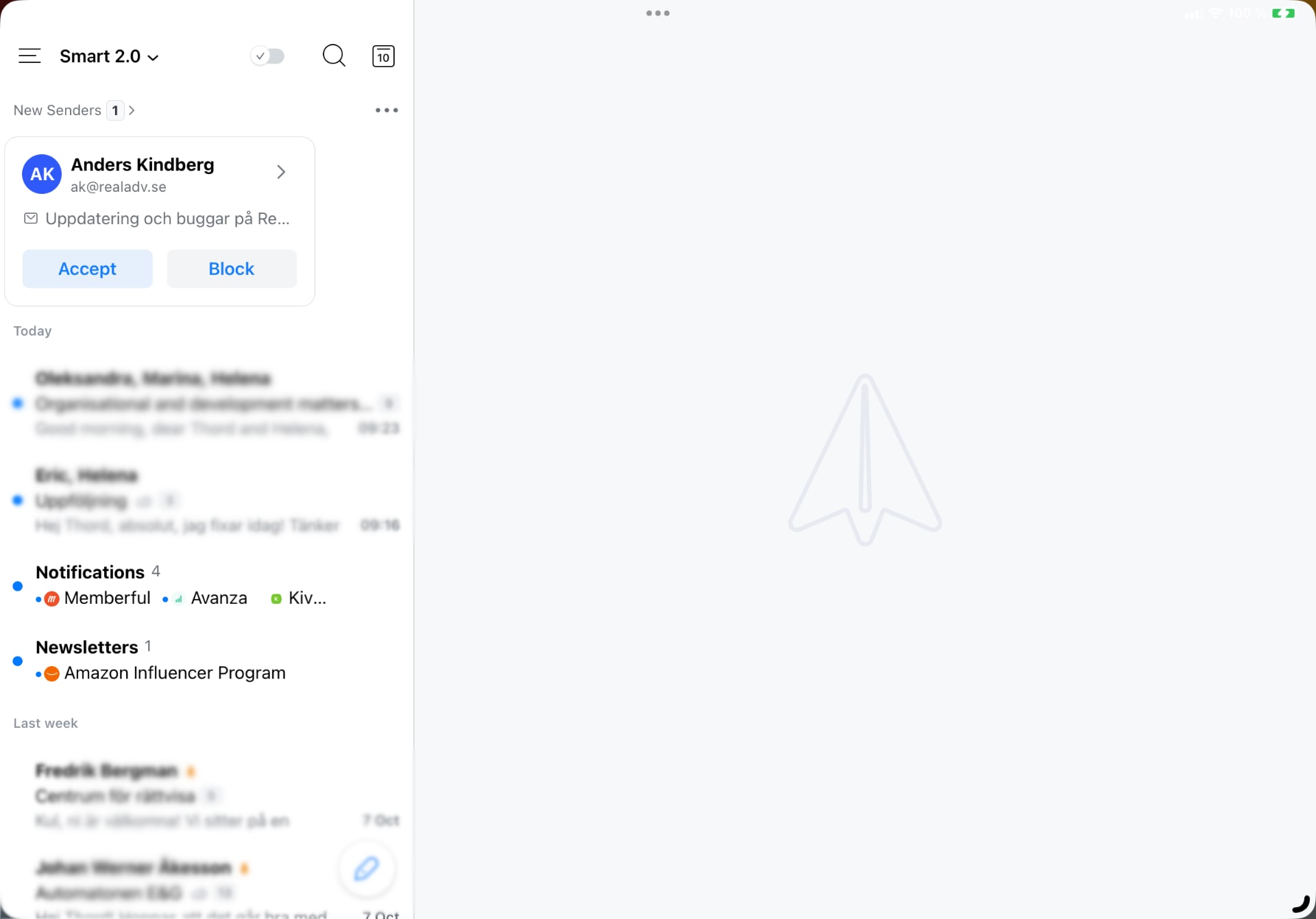
You don’t have to have a subscription to use Spark, but you probably want one. The team has, successfully, ripped-off Hey’s screener feature, which I knew someone would. I like it, you get an email, accept or block, and that’ll handle where emails end up. All your blocked emails end up in its own inbox.

However, this only works if you stick with Spark, obviously. That means you’ll have to use Spark across the board, which, to be fair, is easy enough since there are apps for iPadOS, iOS, macOS, Android, and now also Windows.
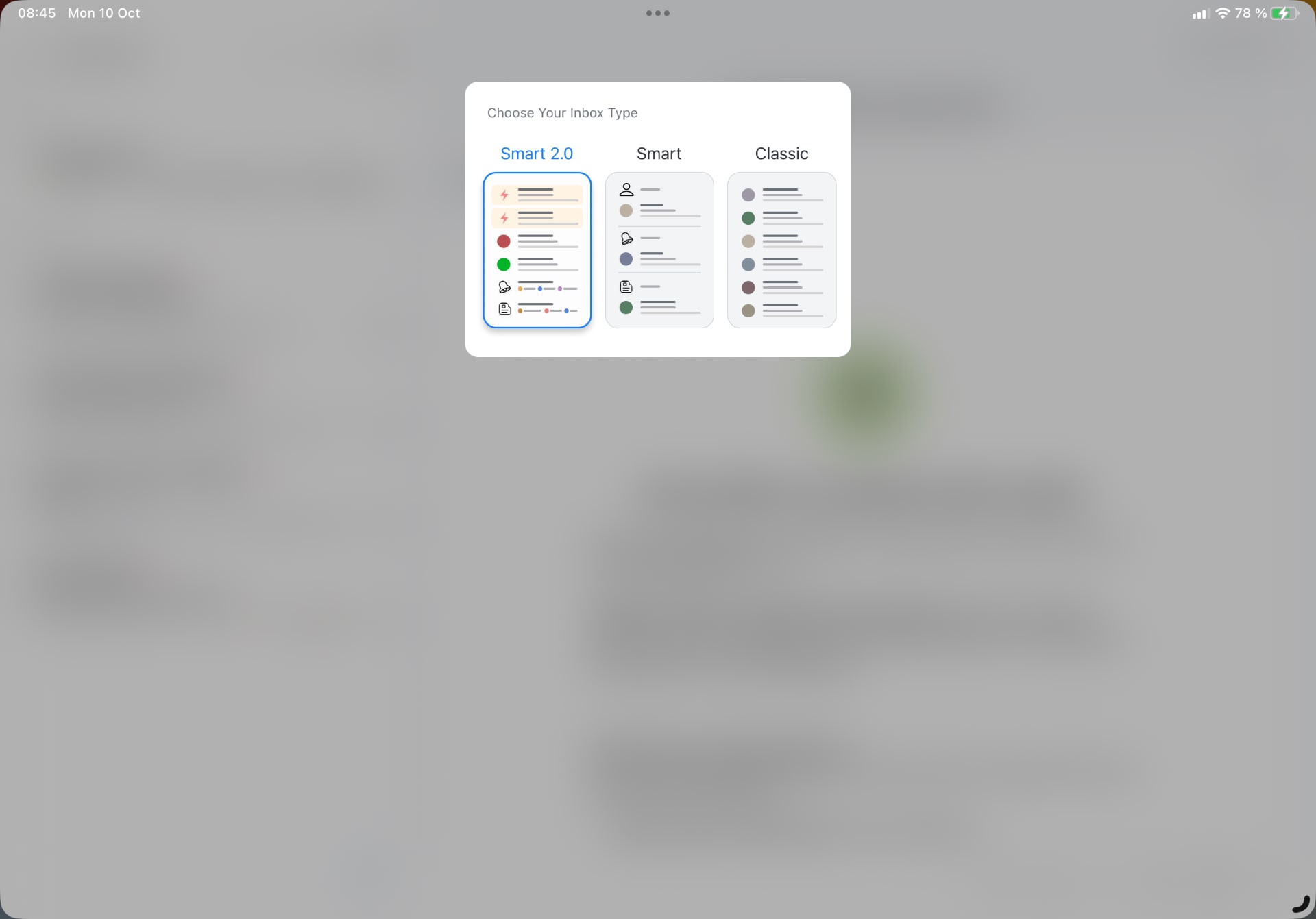
The new smart inbox, ”Smart 2.0”, organize your emails so that the priority contacts are shown up top, newsletters are grouped together, and so forth. It’s pretty nice, albeit not worth a subscription, I’d say. Spark also introduces their take on Maildrop, which lets you send large attachments as downloadable links. This is something that Apple has done with Maildrop for quite some time, and I like the feature.

All in all, the Spark update wants to make email a lot less stressful. A good example of this is that Spark wants you to mark an email as done, which archives it, but feels more rewarding. It’s a clever touch, just as the set aside features (i.e., snoozing) Spark has had from the beginning.
Looking at the announcement blog post, it certainly looks like a pretty app, but the reality, on an iPad, isn’t quite there. I don’t like the settings panels, and the actual app has always looked worse on an iPad than on macOS, for example. It’s just not that polished, which is a shame. This is a problem with Readdle’s apps, I mentioned it when I wrote about their Calendars app, too.
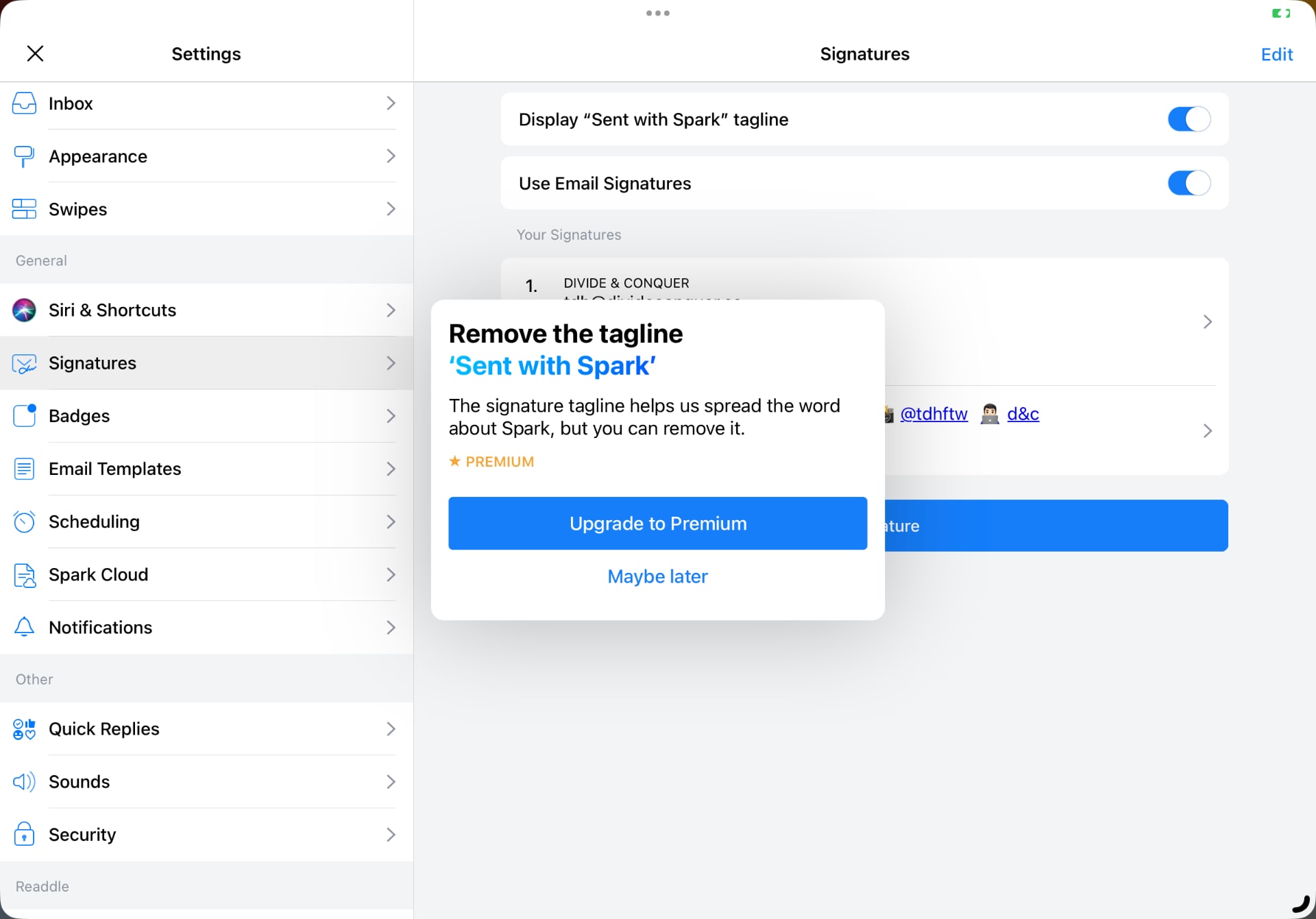
Oh, you know those annoying links email apps insert at the end of your email, to promote themselves? Yeah, Spark does that, and while you can remove the link manually before sending your email, you can’t disable it without a premium subscription. That’s not super-nice, I must say.

This isn’t a review, more like a first impression sort of thing. I’m using the default Mail app, and while there are plenty of good ideas in this new Spark update, having another subscription isn’t particularly appealing to me. You might like it, though, so I encourage you to give it a go. There’s a free trial to play with the premium features too, so have at it.
