I’ve been using the iPadOS 15 beta on my, err, beta iPad Pro since the first developer beta was released at WWDC. It’s really getting there, although I must stress that it’s still a beta, so some things will be wonky. I wouldn’t run the iPadOS 15 beta on my primary iPad Pro because there are too many things I rely on that just won’t work on the beta just yet. That will depend on what you’re using your iPad for, obviously, but be careful nonetheless.
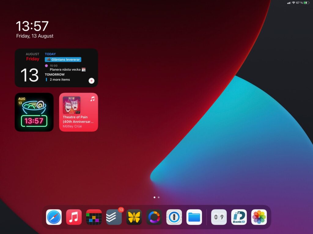
Anyway, I just wanted to share a short post about the widgets in iPadOS 15. You can finally put them anywhere on the home-screen(s), so they’re not contained to the left-hand side anymore.

Now, most apps that I’ve got installed haven’t released any iPadOS 15 updates yet, so I’ve only seen the new wide widget on stock apps. This new wider widgets are larger than the previous largest one, twice the size in fact, which you can see from the GameCenter widget in the screenshot below.

The new App Store widgets highlights the day’s editorial picks and stories, which, I thought, was pretty nice.
The wide size makes a lot of sense when looking at the Files widgets. It lets you show your latest files, or files from a specific folder, in grid view, which I like. This has been handy already, when working across devices.

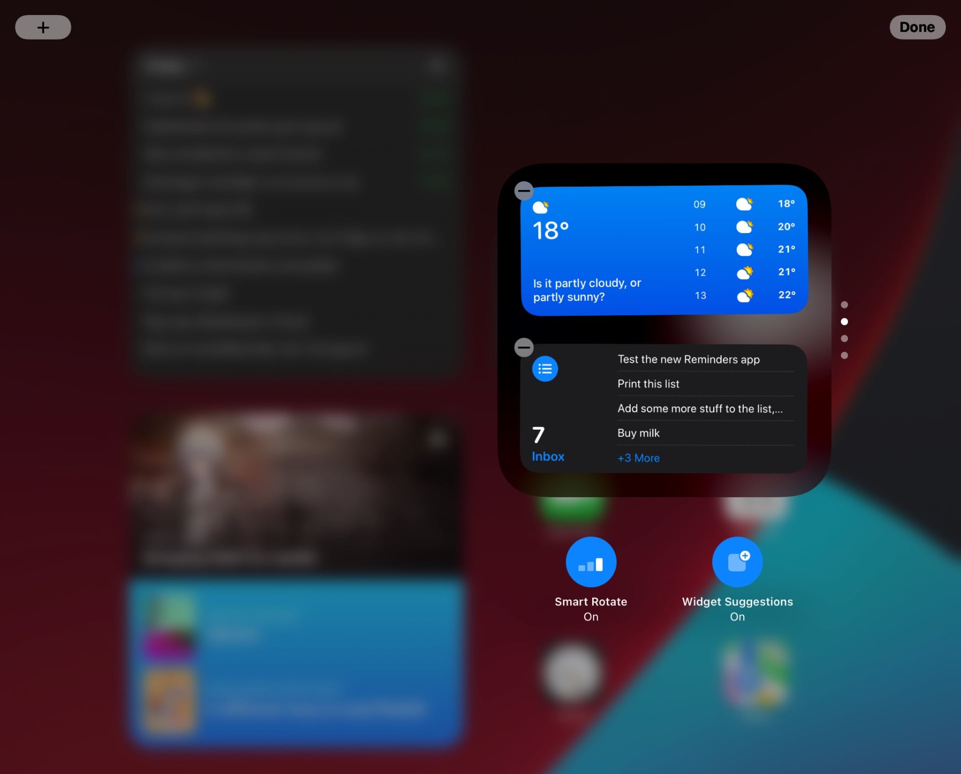
The last thing I’d like to highlight is the new settings for stacked widgets. When entering jiggle mode, you get two new icons below the stack where you can toggle smart rotate and widget suggestions. It’s nice to have these settings with the actual widget, rather than in the interface for picking widgets.

All in all, I’m optimistic about widgets on the iPad in iPadOS 15. This, together with the new focus mode, feels like it could open up new workflows and setups. With the right widgets, you could build informative dashboards, and for those of you that have the iPad as a partner device to a traditional computer, that could prove very useful. I’m eagerly awaiting to see what app developers will do with this.
📧 Related: Switch to iPad #50: WWDC highlights
