🆓 This member post is free for all, thanks to our paying subscribers. Enjoy!
Hey there!
I’d like to talk about multitasking. It’s something iOS users clamored for a long time, and when we got it, we wanted true multitasking. You could argue that iPadOS has delivered on that by now, but it’s not that simple, obviously. Things rarely are.
I’m here to tell you that multitasking is overrated.
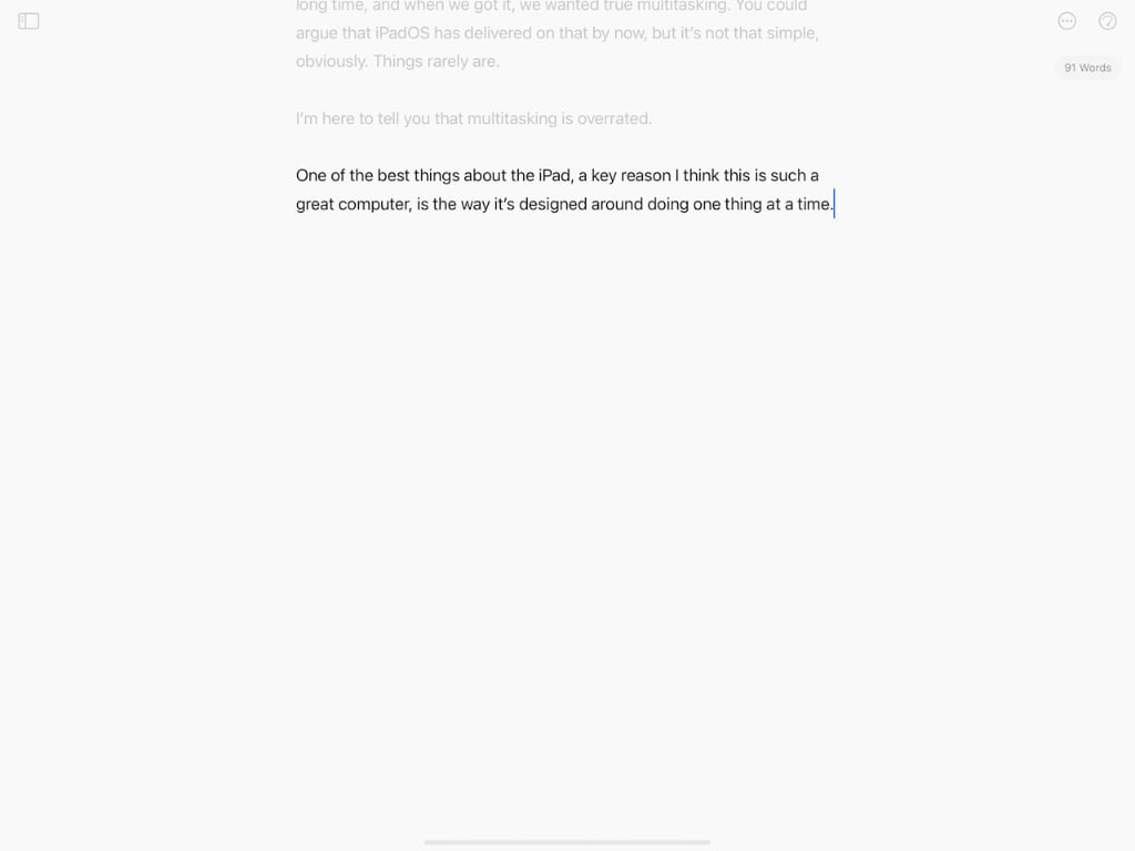
One of the best things about the iPad, a key reason I think this is such a great computer, is the way it’s designed around doing one thing at a time. You can do more than that, but essentially, iPad apps take over the full screen, and they get your undivided attention.
Compare this:

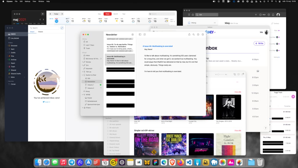
to this:

The top one is a screenshot from my iPad Pro, whereas the other one is a screenshot from a 27” 4K monitor connected to one of my M1 Mac minis. Which one will make me hammer out the most words? Which is more prone to diversions?
Granted, you could fullscreen (most) Mac apps too, getting the same kind of focus. I’m writing this in Ulysses, that works well in fullscreen, but it looks and feels silly when it’s 27”, doesn’t it? Apps aren’t meant to be that big, which I guess could be a case against proper monitor support for iPads, but I digress.
Putting apps side by side, or rather, app windows side by side, has been the killer feature for traditional computing for so long, it’s almost hard to remember where it began. While Apple might’ve been the first truly successful company utilizing this sort of interface, Microsoft’s Windows made it the staple it is. And you know what, it made sense at the time because screen resolutions was so low. 640×480 pixels, that was a proper monitor when I grew up. Games looked great in fullscreen, and you had to maximize Microsoft Word because of all the toolbars, but other apps (sorry, programs) worked better in windowed mode.
Then the screens grew, and the resolutions with them. The only thing that stopped this growth in pixel real-estate was the introduction of retina screens (to speak Apple). Suddenly, you had all those pixels, but they were used to sharpening things rather than to give you even more room for (teeny-tiny) app windows.
Look, I get it. When I’m working on a design, I really enjoy the larger screens. Web-apps like Figma (the new standard for many teams, including the D&C one) work best with lots of space. They’re like the PageMakers and Quark Xpresses of yore (and more recently, anything Adobe) — actual screen size mattered because you laid out a large piece of paper. Now we’re doing websites, and they’re even bigger. (Although there’s an argument against large screens in web design too, but that’s a different matter.)
But writing? No, I don’t want a 27” white paper staring back at me, with a small column in the middle. I want focus. And if I need to research something, I want to do that, focused. The only time I’d want two app windows is if I need to constantly reference something, like when I’m translating a piece or looking up facts.
I don’t need 27” for that, I can just do Split View (or even Slide Over) on my iPad.
Multitasking, when referred to as the user using multiple apps, is broken as a concept. You interact with one thing at a time, possibly referencing a second, but it’s still not simultaneous.
Multitasking, when referring to apps doing their thing in the background, is, of course, brilliant. But you don’t need to see the app doing its thing, the key being in the background, and thus you don’t need the screen real-estate.
I often come back to this when thinking about why I prefer the iPad to a traditional computer. Screen size can be a great feature, when designing, or debugging code, running virtual machines and the like, but they’re not universally helpful. They’re just big, at times, and I find more and more that I’d rather focus on what I’m doing, rather than seeing all that unused space. Even if I size an app window to the perfect fit on a 27” screen (which more often than not matches my iPad Pro’s screen in size), the fact that there’s room for more around said window is bothering me. It has no purpose other than to, potentially, offer a distraction. And it will, if you haven’t minimized or hidden your apps.
The iPad app is just there. You have to choose to put it side by side with another app because when you’re leaving your email to read your Twitter, the new app will replace the former.
Focus. I like that.
There are apps that sometimes live in Split View for me, but they’re not many. I often use Telegram in Split View with Messages for example, they match each other nicely. That doesn’t mean I’m multitasking, they’re the same to me: I communicate with people. It just happens to be different protocols. I don’t care if I’m telegramming or messaging with friends, it’s the same sort of task. It’s not multitasking. I stay focused on the task at hand, then I move on, and both are banished to the background.
Needless to say, I keep my notifications to a minimum. What’s the point of getting the focus of a one-app view if you let other apps to poke you with notifications all the time? But that’s a different story.
I’d love to hear how you (yes, you!) reason around multitasking, both in general and when using iPadOS in particular. It’s an interesting subject. Please don’t hesitate to hit reply (if you’re reading this in your inbox), or tweet to @tdh.
That’s it for this week. I’ll jump over to another app now, so I’ll see this one, and you all, soon. Take care!
— Thord D. Hedengren ⚡️
