
🆓 This member post is free for all, thanks to our paying subscribers. Enjoy!
Hello!
Today’s issue is the first in a series, I think. The iPad is a marvelous design tool, one that I use for all my projects including the ones I do for Divide & Conquer, my digital agency. That means I’m drawing logos, designing websites, mocking up apps, and everything in-between on my iPad.
This issue will tackle designing a website on an iPad. In fact, we’ll be designing my new blog (!), and I’ll do my best to talk about what to think about when getting into such a project on your iPad. We’ll be looking at other design needs in future issues, but there’s a purpose to starting with this particular project. You see, we’ll build the whole thing, and launch the bugger too! But that’s for a future issue, for now, let’s get cracking on that design.
What we’re going to do
The scope for this issue is to create a minimalistic design for my new blog (or site, or whatever – you’ll see). That includes things like:
- Setting up artboards for the necessary screen sizes.
- Creating a logo and exporting it.
- Laying out text and elements.
- Organizing the design so that it’ll be easy to work with when I develop the site.
Since time is valuable, and I enjoy minimalistic design for sites like this, we’re not going haywire with the visuals. On the contrary, I want the site to be clean and simple, focusing on the content, with a nod to the internet of yore. I get enough flamboyant design in my day job, if you know what I mean.
So, that’s the scope. The tools we’re going to use are:
- My 12.9” iPad Pro (see my setup for more).
- Apple Pencil.
- Magic Keyboard.
- Affinity Designer.
That last one is a premium app from Serif, prized at $20 and well worth it. The Affinity suite are giving Adobe a run for the money, without nasty subscriptions. Let’s talk about that one for a bit, shall we?
The Affinity apps
If you’re working with web design you’ve probably moved on from Adobe a long time ago, but there was a time when Photoshop (and possibly Illustrator, when SVG support came along) was the tool of the web designer’s trade. Not so anymore, and while Adobe are trying to get us to use Adobe XD, they’re far behind the likes of Sketch (Mac only) and Figma. The latter is the newest, shiniest star, but unfortunately it doesn’t run on an iPad, despite being a web app. It’s a shame, there really isn’t any reason why it shouldn’t, but web apps are tricky beasts so hopefully the rumors of an iPad version will be proven true in the future. Figma is a great app for designing websites and apps, although I find it somewhat lacking for the finer things.
Anyway, we’re going with the third app that makes Adobe look bad, namely Affinity Designer. It’s one of three apps in the Affinity suite, where two are available for iPadOS. The Affinity suite is taking Adobe on without any subscriptions, their apps are carrying a premium prize but not expensive, not by a long shot. They’re also cross-platform (you have to buy the apps individually though), and they share the same file format so you can go from Affinity Photo to Affinity Designer without any hassle. You can even open Affinity Publisher documents in Designer should you want to, even though Publisher, their take on InDesign, isn’t available for iPadOS just yet. It’s coming though, maybe even before the year is over.
All Affinity apps share a similar user interface, and while you might recognize the old school look and feel from Adobe’s software on your Mac or PC, you’ll get something a bit different on iPadOS. In fact, prepare yourself for something of a steep learning curve, so I’d recommend you spending some time with official tutorial videos. Just getting an introduction to the interface and its gestures makes it worth it because otherwise you’ll be a bit lost, and quite possibly make life harder than it has to be.
⌨️ Keyboard supportI spend most of the time interacting with Designer using the Apple Pencil, but there is some keyboard support, like moving things around with the arrow keys and the like. It complements the Pencil nicely in Designer.
Creating the Bored Horse logo
So yeah, my new online publication will be called Bored Horse. Let’s not dwell on that, but rather move ahead and create a logo for it. I’ve got this idea that I’m going to flirt with the web I grew up with, so expect monospace fonts and pixelated things. In fact, I found a type I liked for the Bored Horse logo, but decided it wasn’t goofy enough. My solution was to type it out, get the spacing right, and then convert the type to curves.
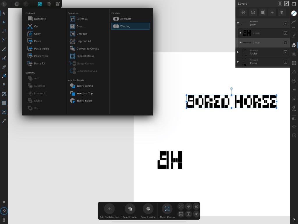
What you see above is Affinity Designer in its glory. This is such a small design project, so I’m putting all my artboards, which are areas to design in, on the same workspace. I normally don’t put the logo with site design, but again, simple project.
When you convert type to curves you get a group with every letter as a vector object. I can tweak the nodes if I want, but for now, I’ll just settle with flipping the “B” in Bored Horse so that it’s mirrored. Yeah, I know, cutting-edge design at work here. Flipping is easy, just mark something and find the corresponding pane on the right-hand side for positioning, sizes, and the like.
This is probably when it’s a good idea to talk about personas, which is something the Affinity apps use. Or rather, you should read their description of it. Suffice to say, depending on the persona you’ve selected – designer, pixel, or export – you’ll have different tools on the left side, and settings panes on the right. For a project such as this, I’ll be living in the designer persona, relying on layers, and then export some select items (i.e. the logo) using the export persona.
Okay, I’m good with the logo. I know I’m going to need it as an SVG, so if I wanted to I could switch to the export persona, mark the layer group in question, and then choose to export it as a flattened SVG. You’ve got plenty of options for exporting, from PNGs and PDFs to SVGs, and more. All come in various flavors. If you need a working SVG for a website, which is the case here, make sure you export it as flattened.
Mobile and tablet design
I started with the mobile design because that’s the smallest common denominator. It’s pretty standard in modern web design to do this. That means I created a new Affinity Designer document, picked iPhone X/XS from the pre-defined sizes, and ticked that I wanted it to create an artboard. If I skip that last part, the whole canvas will be my artboard, which can be nice but not for this project.
The initial work was then done in the mobile artboard. When I felt it was done enough, I copied the whole artboard and moved it to the side (copy-paste usually paste on top of the copied object). Now I had two mobile artboards, which isn’t what I wanted, so I changed the artboard size to a portrait iPad, and started editing the font sizes, lines and whatnot in the design.
If you’ve ever worked with Sketch or Figma, this’ll look pretty familiar to you.
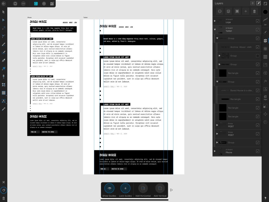
Besides getting to know how you interact with Affinity Designer, which is best learnt by watching the tutorial videos and experimenting a bit, you should familiarize yourself with snapping (the magnet icon in the bottom left), and guides. I like to put in guides for some things. There are several other powerful tools in the same vein, including ordering objects over a set width horizontally and the like.
Okay, so I’ve got things where I want them. This is such a simple design, which I might or might not do another revision or a few other views for before sitting down to actually develop the thing. What I’ve made sure to do is to organize my layers into groups, so that I have a clear overview of what belongs where. That means it’ll be easy for me to just mark the various objects and get whatever properties, be it font sizes or colors, when developing. Messy layer structures are horrible, so don’t be afraid of going a bit nuts with layer groups, and groups within groups.
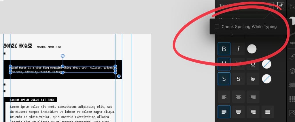
🔡 Turn off spellcheckFor some reason, Designer wants to spell check your text. It usually understands that lorem ipsum isn’t something you want to spellcheck, but other things suddenly get that annoying red jiggly line underneath. You turn that off per session (not forever, unfortunately) by tapping any text object, and then the small hamburger menu on the text pane to the right, to toggle spellcheck on and off. I wish I’d known that earlier.
That’s it, I’m technically at the point where I can start developing this site. I won’t just yet, I’ll let this minimalistic design sit for a while. I might change it, I might not, we’ll see.
The next step for this project is to develop it, and I will, quite possibly next week, right here in this very space. When we’re through with this two-parter, there’ll be a Bored Horse site where yours truly will write things, how about that?
I hope this introduction to doing web design on an iPad was beneficial. We’ll dig deeper on the design front later, talking photo edits, resizing and compressing images, exporting and so forth. As always, don’t hesitate to hit reply if you’re reading this in your inbox, or tweet to @tdh with any thoughts or questions you might have.
Until next time, ☮️!