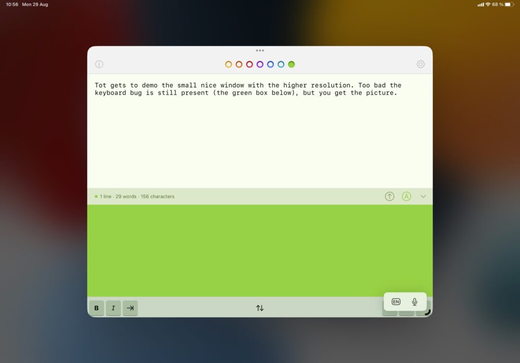
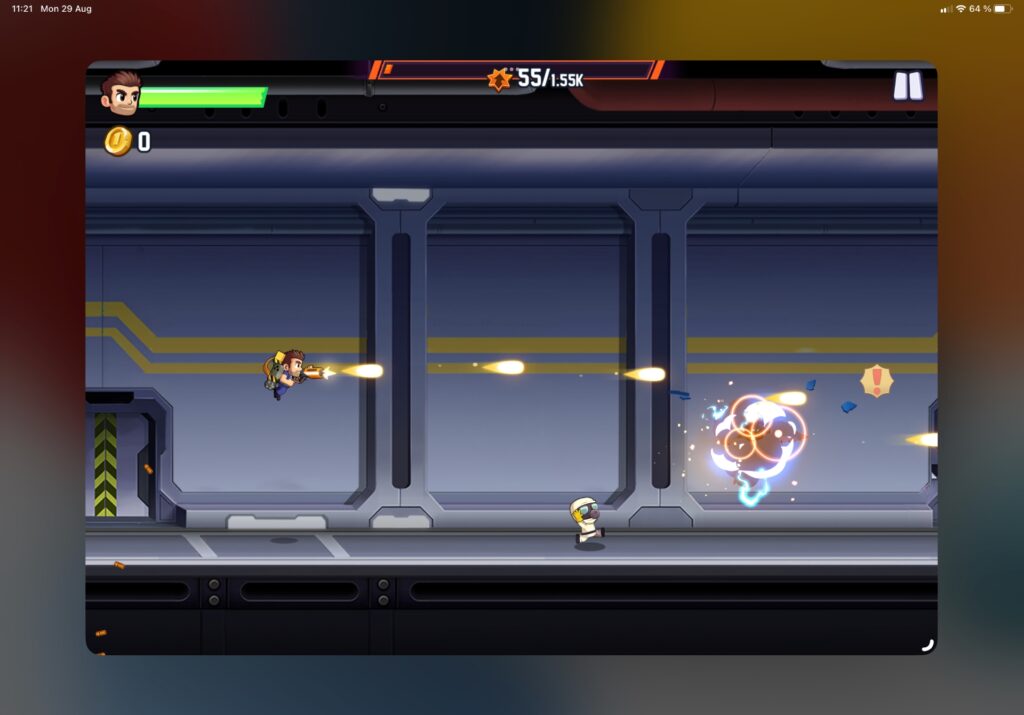
Did you know that you can change the screen resolution on your iPad? Well, you can if you’ve got a M1 (or M whatever, presumably) iPad, and iPadOS 16. You find the setting under Settings > Display & Brightness.
MacBook users will recognize this feature. Modern MacBooks, and iMacs too, come with a standard resolution. It’s the ideal one, in Apple’s opinion, with readable text and that nice retina sharpness. However, you can change the scaling, which is basically changing the resolution that macOS will render things in. This means that text will get smaller, but you’ll get more screen real-estate, at the cost of some sharpness of things. For some, that’s a worthy trade. Since Apple screens are as good as they are, you often find that you’re not really loosing any of that sharpness. For iPads, where you have two choices only, it really isn’t such a big deal, as long as your eye-sight is good enough.
Here are some comparison screenshots, taken on an 11” iPad Pro.
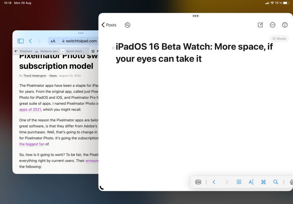
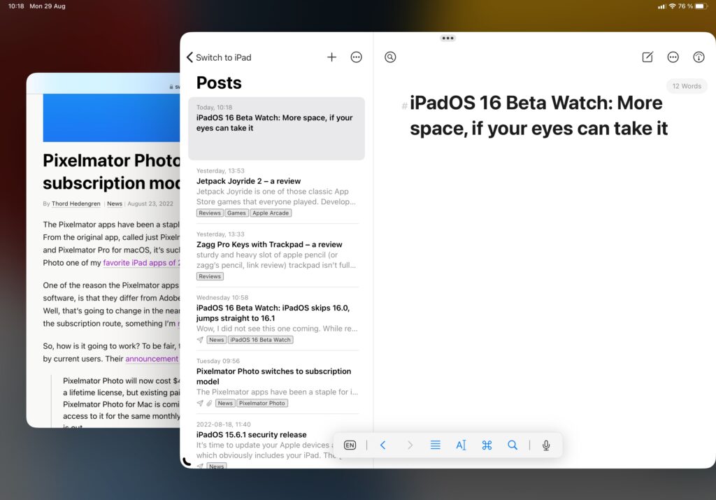
Let’s take a look at a couple of comparison shots taken on a 12.9″ iPad Pro, shall we? First, let’s look at this very website shown in Stage Manager.
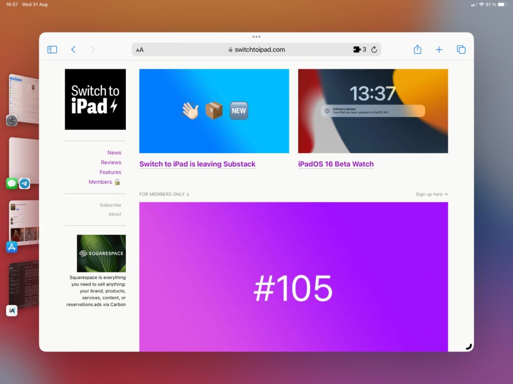
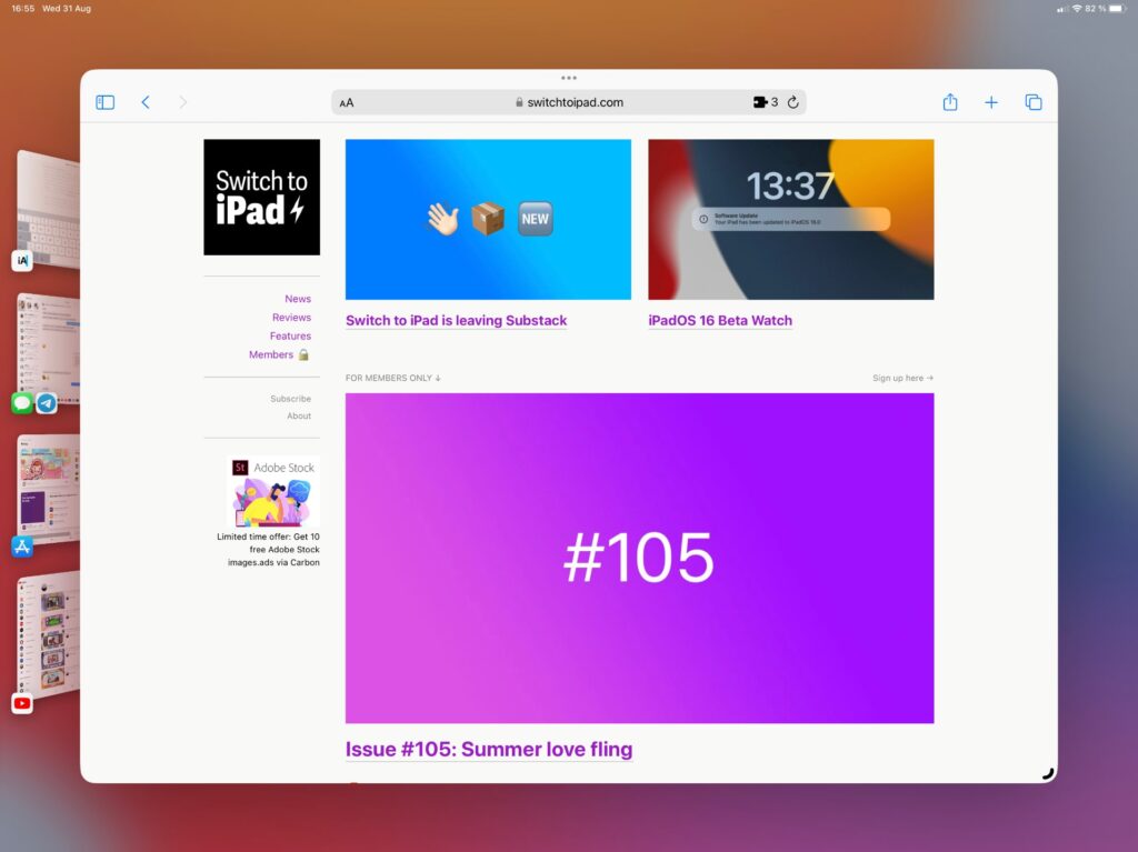
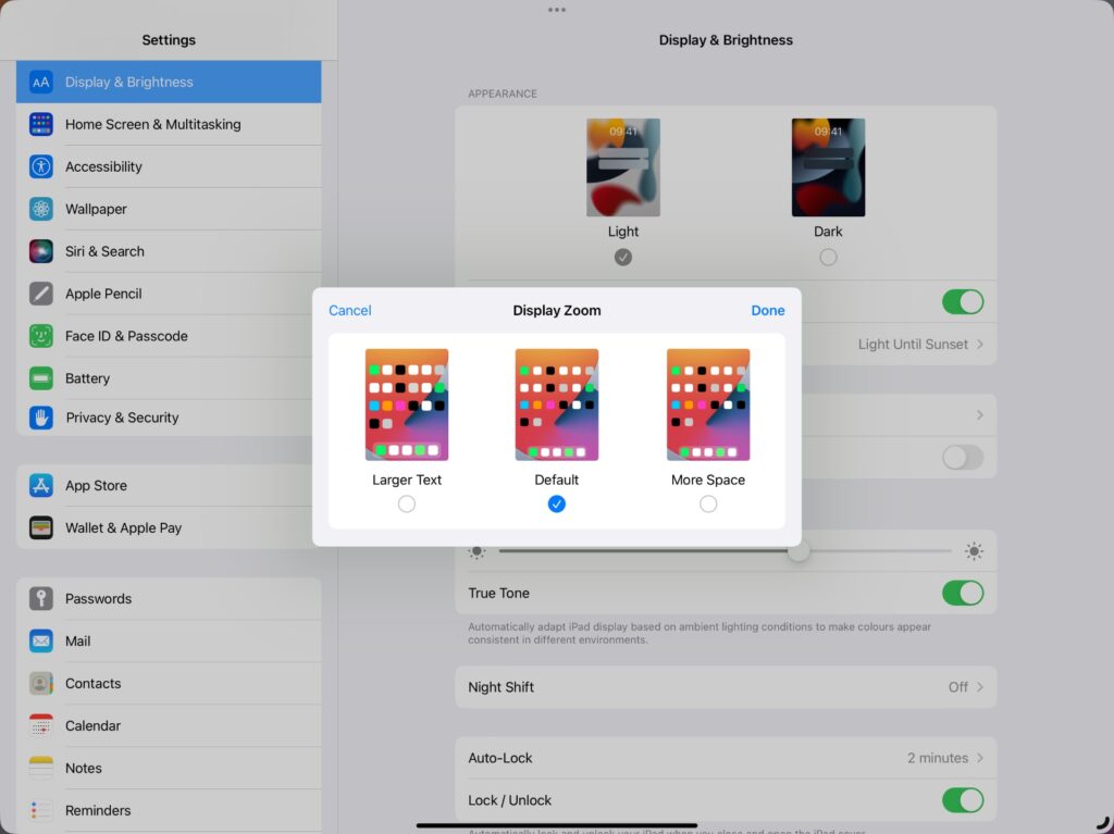
The actual zoom settings pane both displays how weird things look with more screen real-estate, and the difference between the default and more zoom views. Again, the screenshots below are from the 12.9″ iPad Pro, it’s less obvious on smaller screens.
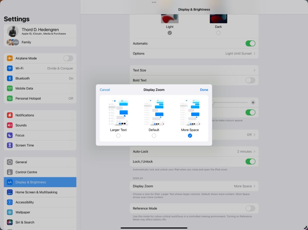
What you might not like, is how some apps make use of this extra screen real-estate. There’s just no way that make the Messages app look good with all that whitespace. It’s the same as with external monitors (in iPadOS 16), where big windows can look a bit weird. The built-in auto-layout feature that comes with apps using Swift UI solves it, technically, but it doesn’t make everything look good.
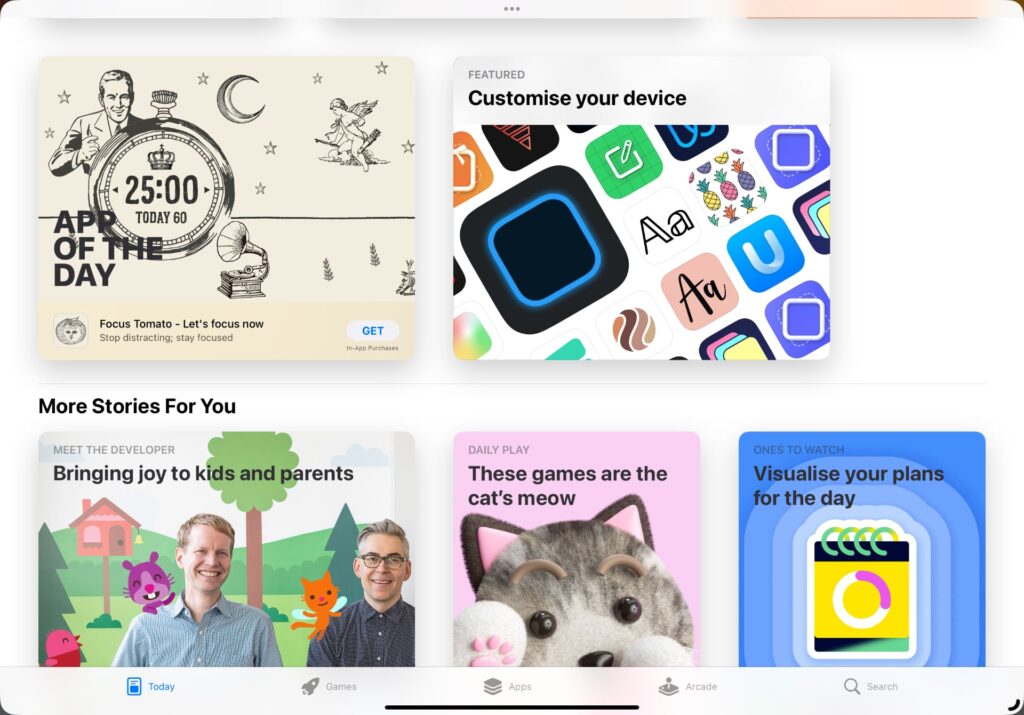
This is where Stage Manager comes in. Resizing app windows, and combining them where it makes sense, makes for a better experience, even if the set screen resolution is a bit too high for some app designs. It makes smaller iPads, like the 11” iPad Pro used for the comparisons above, work a little better with Stage Manager. Jumping back to the standard zoom makes Stage Manager feel truly cramped after seeing what additional space can do. It’s a welcome trade-off for 11” users, solving a problem that isn’t as persistent (but there) on the 12.9” model. That doesn’t imply that I haven’t enabled this setting on my 12.9” iPad Pro because I have. It makes some apps look ridiculous outside of Stage Manager, though. The extra screen real-estate is useful, I like this feature a lot. It might not fit you, or your eye-sight, though, so I’m glad it’s optional.
