There are some things that are just plain weird when it comes to Apple, and what apps they include in iPadOS. The lack of a calculator app, a staple since the very beginning on iOS, is one of those. The other, one could argue, is not having an iPad version of the Weather app. Well, until now, that is.
So, how exciting can a weather app be? Plenty, I’d say, since one of the few subscriptions I gladly renew every year is for the snarky murderbot weather app, Carrot. I’d wager Carrot, and other weather apps optimized for iPad, will see a decline in revenue come iPadOS 16.1 (again, iPadOS is skipping version 16.0 for 16.1, as previously noted). That’s because Apple’s very own default weather app, called simply Weather, is available for iPad now, and it’s pretty good-looking, as it were. Let’s take a look at a couple of screenshots, shall we?
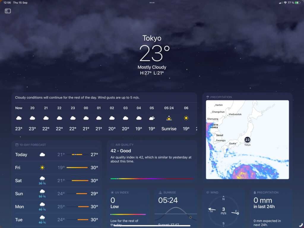
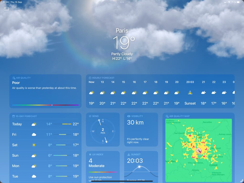
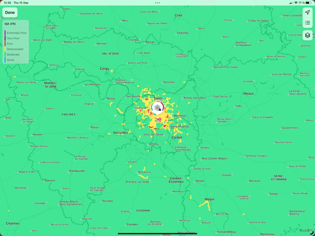
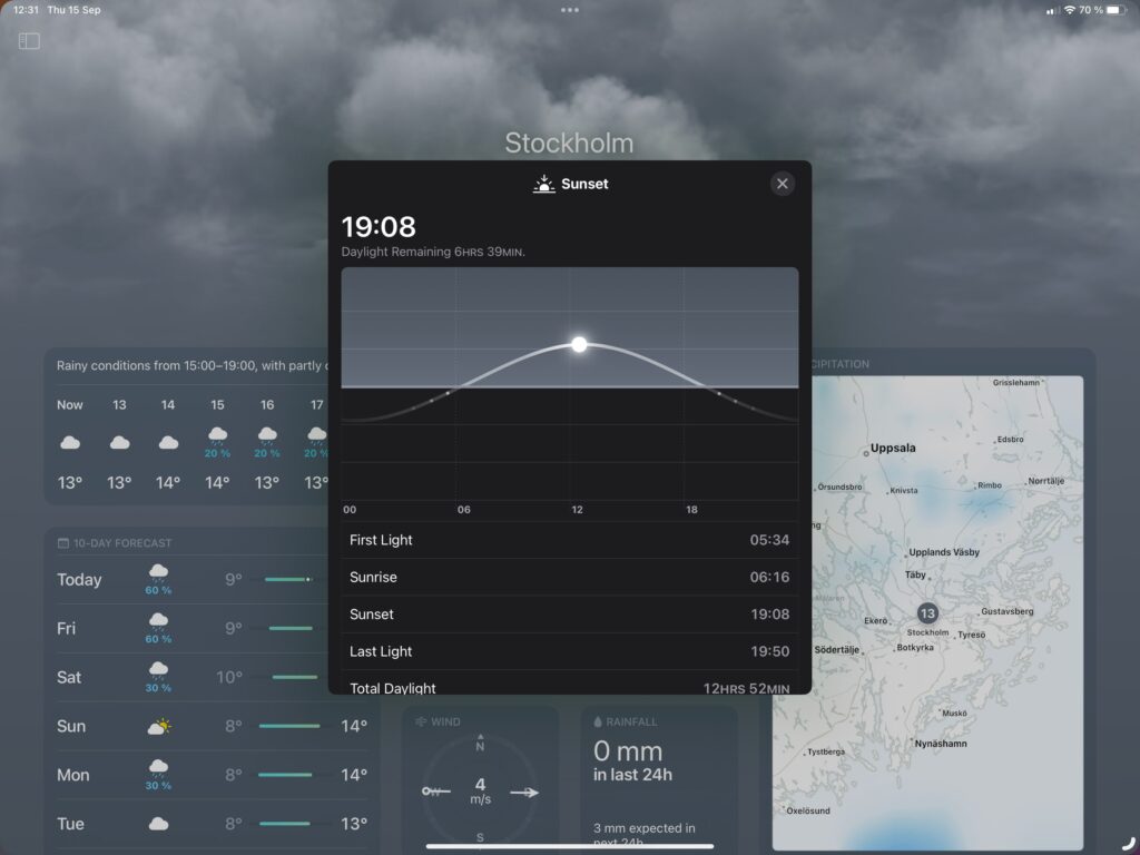
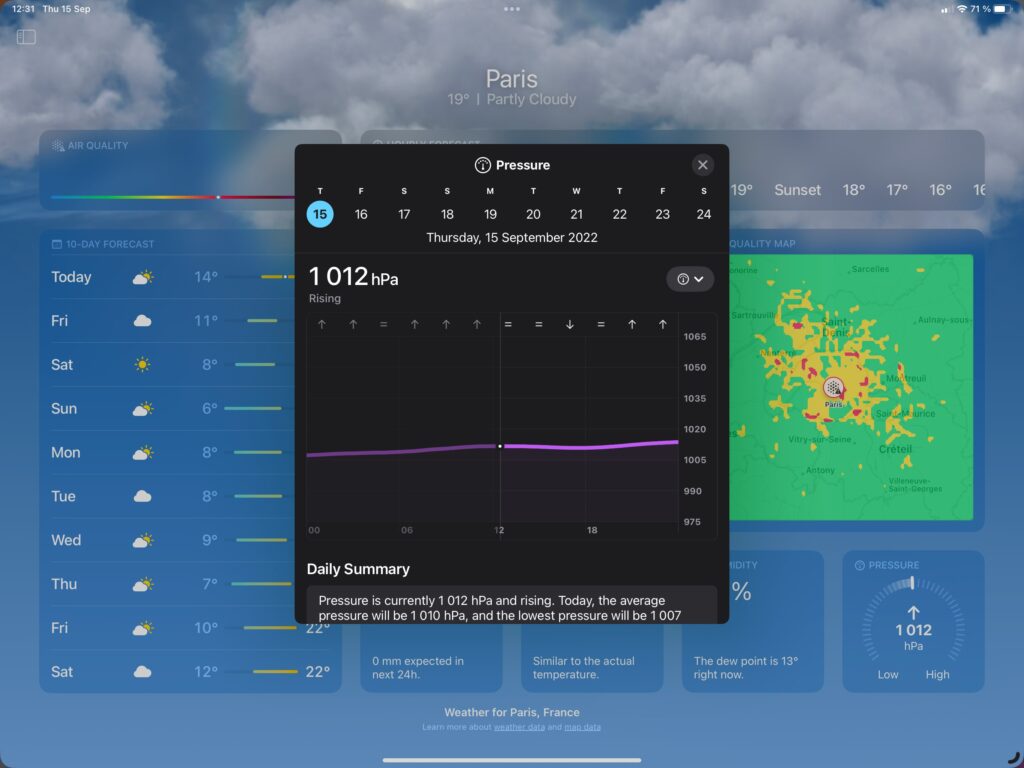
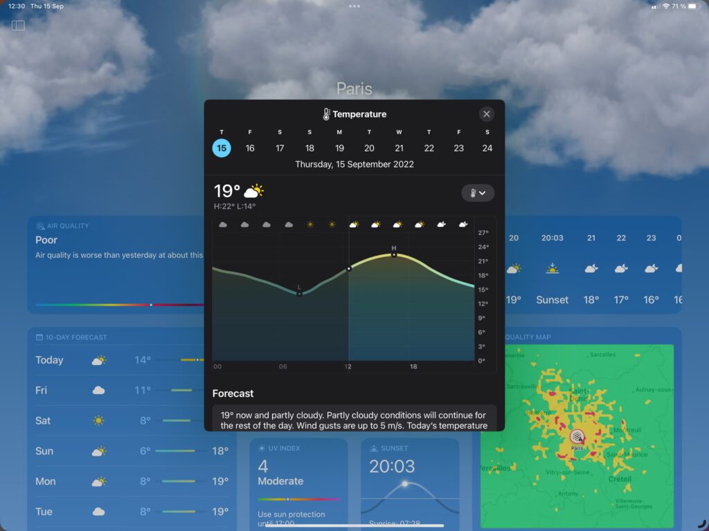
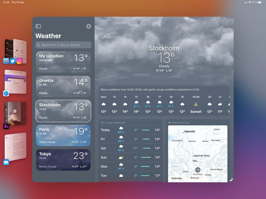
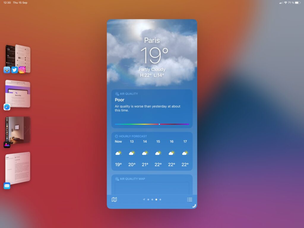
It’s an appealing app, I think, with nice animations. Apple has transitioned Weather to iPad nicely, with ample of information available both at a glance, with more in-depth a tap away. It certainly looks like a charming weather dashboard, doesn’t it? That’s because it is, if this is what you want from a weather app. If you want something else, a different layout, or tweak the sources, then this isn’t for you. You can’t rearrange anything, it’s all tied down.
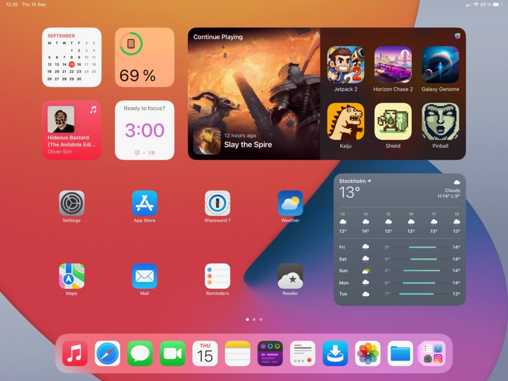
Widgets is another area where the default Weather app keeps me wanting. Apple isn’t even close to being best in class when it comes to offering widgets for their apps. They’re usually sparse, and offered in the smaller sizes only. This is a missed opportunity for iPad users, I’d love to see a nice big weather widget in the biggest size, but alas.
The Weather app is a nice addition, but it could be a little bit, well, more. The fact that it exists will push competing weather apps even further, which is a good thing. And while free is good, and Weather is a nice enough app, utilizing the Dark Sky source that Apple bought years ago, I’ll be keeping my Carrot subscription for another year.
