🆓 This member post is free for all, thanks to our paying subscribers. Enjoy!
Between moving and editing a manuscript, I’ve been building a new site. Yeah, that sounds nuts, but it’s not as momentous as you might think. This new site is a one-pager, celebrating what, I think, is the Best Holiday Ever™️, which is Three Olives Day!
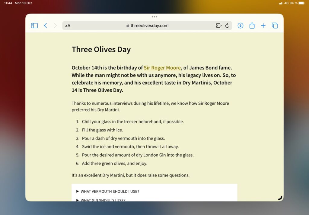
What? You haven’t heard of it? Well, you should, which is why I’m building a site about it. You can read about it on the site – threeolivesday.com – but in short, it’s a day for Dry Martinis, and celebrating Sir Roger Moore, of James Bond fame.
Anyway, every little part of that basic site (I’m a bit pressed for time, for obvious reasons) was designed, built, and launched using my 11” iPad Pro. I’d prefer a larger screen for this (or a working Stage Manager…), but this is what I’m carrying as I’m jumping between hotels and our countryside home while they’re painting our new apartment. So, I figured I’d let you in on how it went down.
Typical product workflow
A project like this would, typically, be broken down into the following phases:
- Inception and concept.
- Design.
- Development.
- Deploy and beta.
- Launch.
Sometime during this phase, the actual content would need to be produced and, depending on the kind of site, added to a content management system. This, being a one-pager, had fewer requirements.
The oh so limited design phase
I’ve been putting off building this site for quite some time. I even missed last year’s occurrence, which annoyed me tremendously. This time, I focused on two things in the design phase: Colors and fonts.
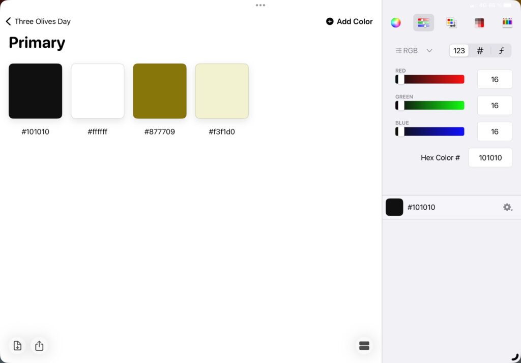
I’ve been playing around with a couple of handy apps for creating palettes. This time, I went with Pastel, a simple app that lets you create collections. At its current iteration, there aren’t many colors needed for this project. I do like that you, within a collection in Pastel, can add multiple palettes for different needs.
I knew I wouldn’t have time to neither design nor build anything particularly complicated, so I embraced simple when it comes to typography. Adobe has a nice font called Source Sans Pro, which I decided to go with for this project. These days, it’s easy enough to install fonts on an iPad, but I already had this setup through Fontcase. I did a quick test in Pages (!) just to get a feel for the font, which I knew would be just fine, albeit nothing too fancy, before committing to it.
I didn’t bother with a logo at this time due to not knowing how much time I’d actually be able to spend on it.
This might very well be one of the shortest design phases I’ve ever had. I had to move on, the rest would have to happen during development.
Old-school HTML
If you’re into web development and have been using WordPress for a long time, you might’ve heard of me. I’ve written and sold hundreds of thousands of books covering WordPress, back in the day, and was a prolific blogger on web development. My digital agency, Divide & Conquer, does plenty of WordPress projects for big clients, including H&M, The Absolut Company, and more.
For this project, however, I didn’t want something as big as WordPress. I could’ve just launched the site using a free theme, or build my own real quick, but that’d make the workflow a bit messy in terms of using an iPad. I could also have used one of the seemingly countless page builder services, and been live in minutes, this being a one-pager and all. But no, I wanted to kick it old-school, while leaving room for improvement without having to migrate from one service or another. I also wanted everything under version control, using git, so the first thing I did was to log in to Github and set up a repository. Then, I added this to popular git app Working Copy, which means that I can access the files in the git repository in any app that supports Files.
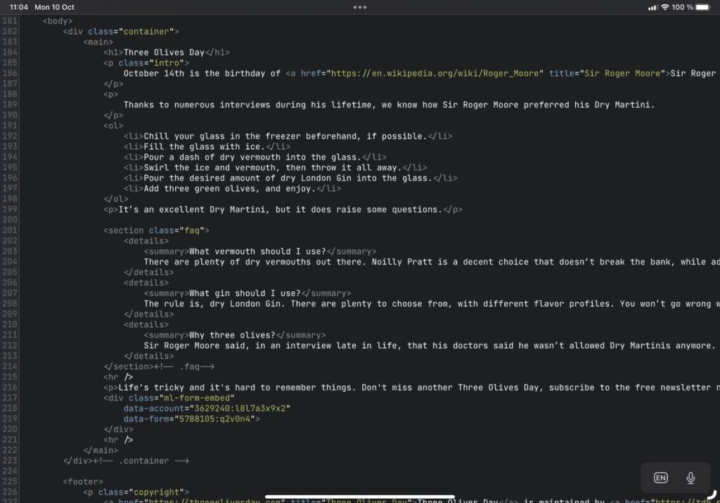
There are several nice options for working with HTML and CSS on iPadOS. I’m partial to Textastic, which works great with Working Copy, and even has a built-in SFTP client. This time around, I wanted to try something different, so I went with Runestone. Now, I’ll have a proper review of Runestone down the line, but I must say that I like its no-frills approach. On the surface, Runestone looks like a pretty simple code editor, but you have plenty of ways to tweak and tune it to make it your own. For this project, I don’t miss the lack of tabs support – you keep one file open at a time – but I’d imagine this might be annoying down the line. We’ll see, for now, I happily unlocked the premium version to support Runestone’s continued development.
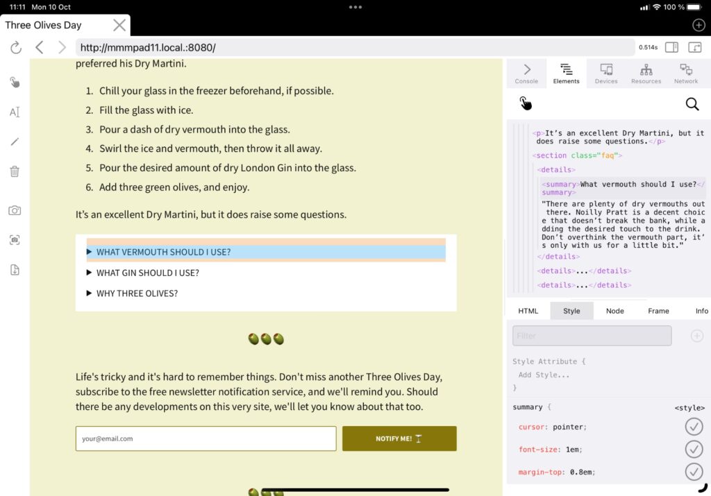
There’s a lot of previewing when developing. Runestone doesn’t have support for this out of the box, as Textastic does. I like Inspect Browser for previewing and fiddling with code. Problem is, you can’t just open an HTML file and view it, like you could on your Mac, for example. The solution is called WorldWideWeb, and it’s a simple web server running in an app. It’s not perfect, you’ll need to enable background support which plays a little sound to keep the server alive; otherwise it shuts down when the app isn’t in the foreground. This lets me preview the server’s local URL in any app, or anywhere on my local network, as it were. And yes, that means that I can use the URL – http://mmmpad11.local.:8080/ in this case – to check the site on my iPhone, too.
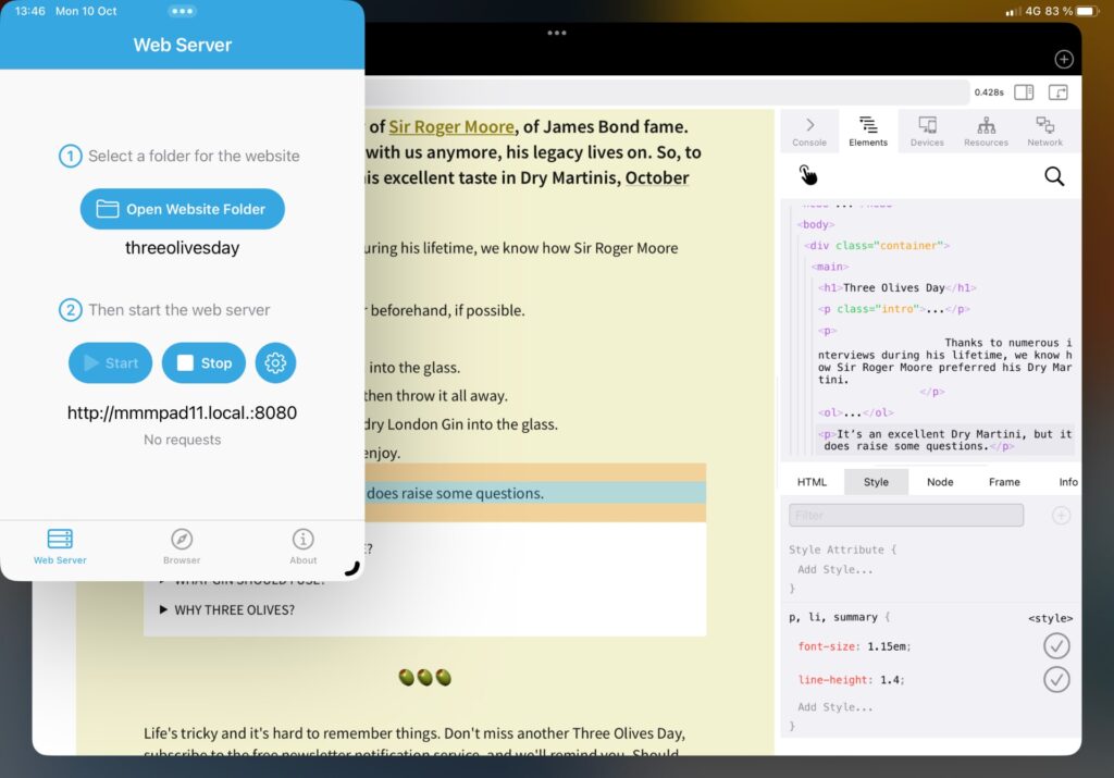
Now, I said you had to rely on that background sound setting to get WorldWideWeb to run in the background. While that is true, there’s a pretty cool way around it, and it’s spelled Stage Manager. Just put WorldWideWeb in the same space as whatever browser you use, and maximize the browser so that WorldWideWeb runs behind it, and you’re good to go. This was an unexpected benefit of Stage Manager, and the fact that it can get apps to run in the state of being in focus, without actually being seen.
So, yeah, I can easily write code, preview it in a dedicated browser on my iPad, but also test it on my iPhone, thanks to these tools. Thanks to Stage Manager, it’s not even as cumbersome as it used to be, although it’s still far from perfect. I mean, I can do the same thing without having to jump through hoops on a Mac, that’s still true. The hoops, however, have become less troublesome, I must say.
Deployment
Cloudflare has a nice solution for hosting static pages (and many other things, including apps) that I’ve used for other projects. The way it works is, you connect your Github (or similar) account, and define which repository and branch that should get published, and Cloudflare will take care of the rest. This particular service is called Cloudflare Pages, and it’s straightforward to set up.
I’ve set it to listen to my live branch for the Three Olives Day repository. Cloudflare will, however, create temporary deployments of other branches as well when you push to them, so it’s easy to test features before going live.
I already had the domain name, threeolivesday.com, hosted on Cloudflare, but that’s something to think about if you want a similar setup. When it’s there, setting up the necessary DNS is a button tap away. Just set up your Cloudflare Pages project first, and you’ll find it in its dashboard.
And, a push to the live branch later, and we’re live!
A bit more design, maybe?
So, as I’m writing this, I find myself with a bit of extra time. This can certainly be put to good use for Three Olives Day, don’t you think? I mean, the olive emoji 🫒 is nice and all, but it’s got a pimento in it, and renders poorly, so I’m hesitant to overuse it.
Enter Vectornator, a vector drawing app that’s been getting better and better the past year. I tried it out for a project about a year ago, possibly more, and found it promising but lacking. I don’t think I ever mentioned it in the newsletter, there hasn’t been a proper review, at least. Well, I’ve been meaning to give it another go, so here we are, drawing olives.
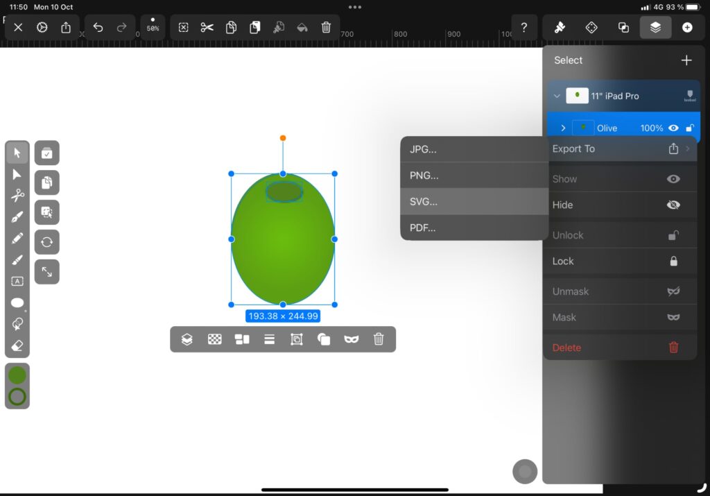
I’ve a mind to make a logo of sorts for Three Olives Day, and there should probably be an olive in there. We’ll see how that turns out, if it does at all, when you get this letter (I’m writing it on Monday due to traveling arrangements on Tuesday). You’ll see the latest version, if used, live on Three Olives Day.
Either way, exporting to SVG or PNG is easy in Vectornator (you can also export to Illustrator, PDF, and JPG), and that’s what I’d need for my site. I’ll just save the image to the git repository folder, using the Save to Files dialog, where I’ll find Working Copy and its file structure. This’ll give me access to it properly. Incidentally, this is also how I got those font files in there, I just downloaded them and saved to a folder in the repository. That’s a must, otherwise people without Source Sans Pro installed would see a fallback font.
Files, for all its limitations, is handy for things like this. Other than iCloud Drive, you can access multiple app-specific folders. Working Copy is one, Yoink (reviewed here) is another, and Runestone too. This is handy when adding things from online sources, or exporting them from one app, to be used differently in another, like an image created in Vectornator, for example. What you need to keep in mind is where your primary files are located. For this project, everything lives in git, which means I need to save the files to its correct folder in Working Copy. That’s the folder I’ll open in Runestone, to make edits, after all.
I have no idea what’ll be the state of Three Olives Day when this goes live. My day’s a mess, and tomorrow’s traveling and changing locations due to our move and renovations, again. Either way, I hope you enjoyed this little insight into my small project. It’s not the easiest way to develop a website, not yet, but we’re getting there, in part thanks to Stage Manager and some clever apps. It feels like we’re on the cusp of something truly useful, at least for light web development, on iPadOS.
For me, having the freedom of working on a project like this on the go, knowing that my iPad is always connected to the internet, is worth a lot.
