Stage Manager, this new way to multitask in iPadOS 16, and the next macOS too, is the reason we’re not getting iPadOS 16 just yet. The release has been delayed until later this fall, and even skipping 16.0, going straight to 16.1. Stage Manager doesn’t work on all iPad either, you need an M1 (or later) equipped iPad to use the feature. Despite Xcode-induced demos on the iPad mini, and the general notion that Stage Manager probably could run on lower-end iPads, limiting the feature to larger iPads makes sense.
I’ve been using Stage Manager on both my 11” and 12.9” M1 iPad Pros, and I’ve got some thoughts on the former.
Let’s start with the latter, though. The 12.9” screen makes Stage Manager shine. While the feature is still somewhat unreliable, it’s come a long way since beta 1. This is apparent on a 12.9” screen, where the app window sizes are less forced. 11” might not sound so much smaller than 12.9”, but it’s night and day. In fact, during these betas (since beta 1, remember), I’ve had periods where I’ve turned off Stage Manager altogether. At first, it felt like a good idea, just poorly utilized, which, again, is why iPadOS 16 got pushed. I turned it off because I needed work done, and thus stability, which, to be fair, isn’t something you can expect from a beta at all. Silly me.
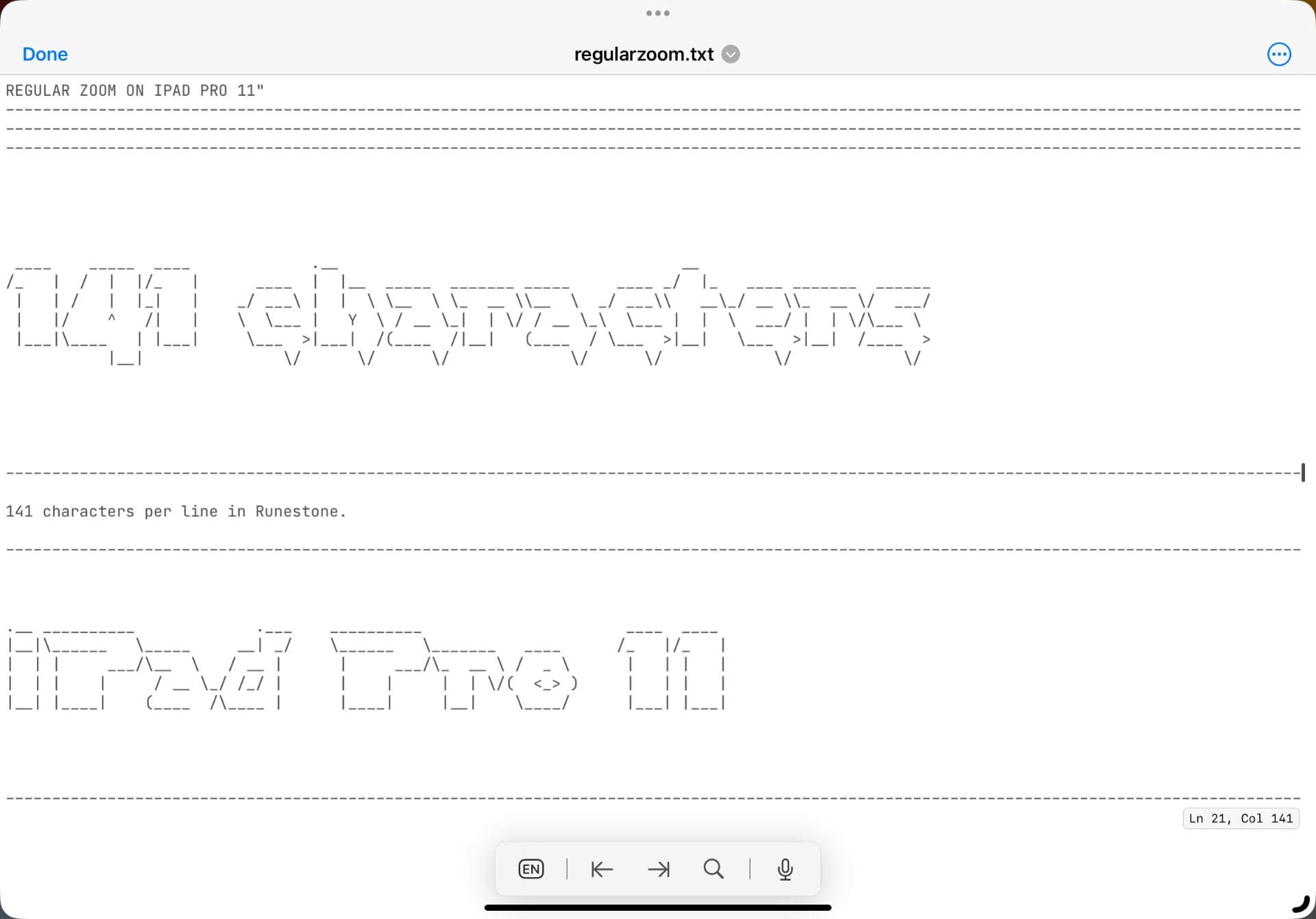
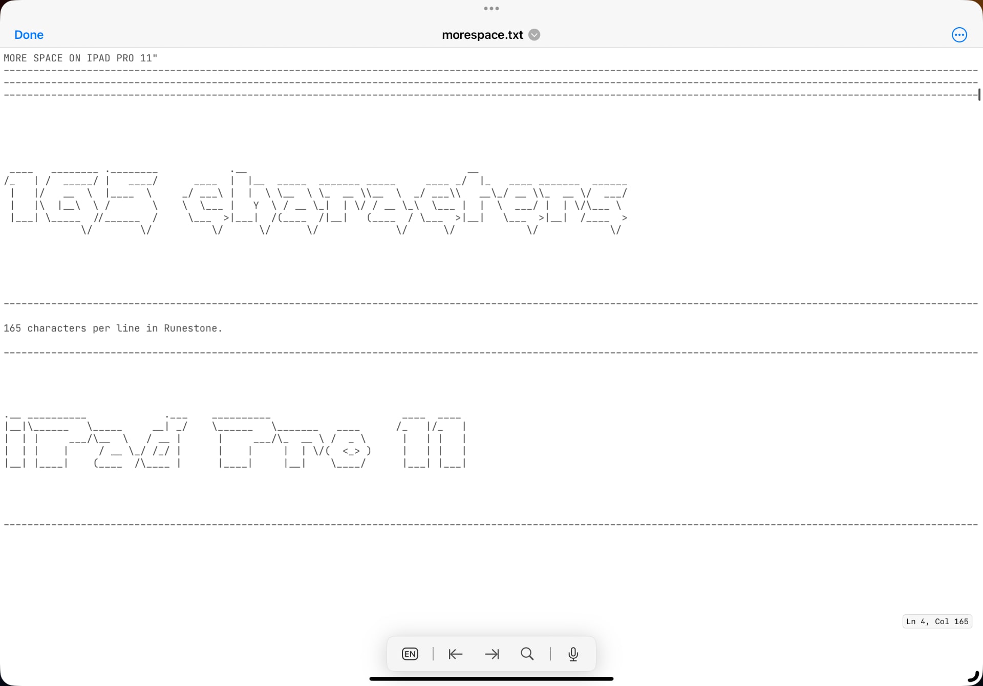
11” is cramped in Stage Manager, there’s no other way to put it. Putting windows together works, sure, especially with both dock and window manager hidden, but it certainly feels cramped. There’s a solution to this, as I mentioned in a previous post, and that’s to increase the zoom. The 11” iPad Pro manages just fine with the more space setting, at least to my eyes. That’s not for everyone though, but with this enabled, Stage Manager is almost as usable as it is on a 12.9” iPad Pro without altering the settings. Of course, 12.9” is bigger and better in every way when it comes to a feature like Stage Manager, and it becomes even more so with the more space setting enabled. This is one of those cases where size truly does matter, and favor the larger one at all times.


All that aside, I do find that 11” is adequate for Stage Manager when enabling the more space setting. It’s enough, it works. Without it, well, then it becomes clear to me why Apple is drawing the line on these sizes. Sure, it’s a power thing, too, and it’s no coincidence that the M1 chip sits in the iPad Air 5, but not in the iPad mini 6. The latter’s screen would be much too small for Stage Manager, and the experience would reflect poorly on the feature, no matter if there’s power enough to run it or not. The same goes for the standard iPad, you just need more room, and you need to get up to those 11” (or 10.9” for the iPad Air 5, obviously – the difference is minimal).
Stage Manager isn’t for everyone. The old and familiar way of putting app windows side by side, using Slide Over and Split View, are sometimes more suited. I’ve found myself arranging windows like this in Stage Manager, so it bears merit. However, if you want to push iPad multitasking further, Stage Manager is the way to do it. And, to get the most out of that, you require space. Changing the resolution with the more space setting is a band-aid on 11” screens, but it’s one that sort of works. Not using the feature, well, it’s cramped, but it still works. 11” sits in the weird middle-ground for professional use already, and this only underlines its position. Stage Manager is a feature designed for larger screens (which also means small laptop screens), and it’s apparent when you use it. Apple continues to view 12.9” the true professional size for iPad users, which makes me worry about the 11” iPad Pro model, especially now that there’s an iPad Air that sits close to it. Here’s hoping there’ll be further refinements to Stage Manager for smaller screens. I’m not holding my breath, though.
