🆓 This member post is free for all, thanks to our paying subscribers. Enjoy!
Hi!
How are you? And, perhaps more importantly, what are your home screens like? I’ve been fiddling with mine for quite some time, trying to find balance. What I needed, it turns out, was an unplanned reboot of my 11” iPad Pro. I had some issues with my cellular connectivity during my Easter trip a while ago, and while I was waiting for the provider to get back to me (not an easy task during Easter), I tried everything I could think of. In the end, and in my desperation, I resorted to resetting the iPad completely. Don’t worry, I had access to decent Wi-Fi at the time, so it was easy enough to get everything up to speed, but during this process I figured, hey, why not reshape the whole thing?
So, I did, and ended up with the most logical, albeit perhaps not entirely complete, home screens yet. This, paired with Focus Mode, has helped me consolidate my iPad use a bit, something that’s been beneficial for me the past couple of weeks.
Let’s talk home screens, then!
These are my home screens
I’ve got five home screens in my current iteration. I tend to add apps to them when I know they’ll get a lot of usage; otherwise, they get to sit in the App Library. That’s where the majority of the apps are, and, despite taking the time to set up home screens, it’s worth noting that I launch most of my apps with Spotlight. Home screens to me is a visual cue to get started, and, obviously, something I use with Focus Mode.
I’ve divided up my home screens as follows. Sorry about the censorship, by the way, there are some personal and unofficial stuff on here.
The home, err, home screen
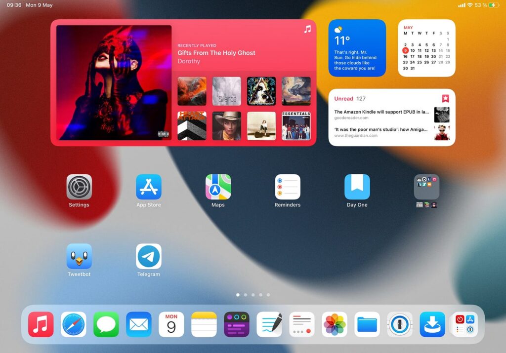
Widgets: Music, calendar app flavor of the month, Carrot Weather, battery, clock, GoodLinks, Find My, Kindle, Streaks.
The idea with the first home screen is that these are general things that I use, and need, every day. Many of these apps see action in the morning, or evening, and the widgets offer at a glance details information about, well, soft things, like the weather, or what music I’m listening to.
The creativity home screen
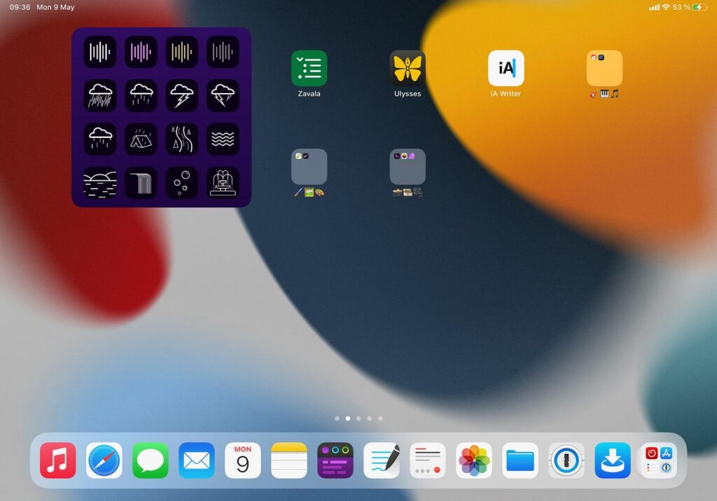
Widget: Just Dark Noise at the moment.
I write a lot, outside of Switch to iPad and Bored Horse. There is the occasional freelance gig, ranging from opinion pieces, to longer features and guides for various tech outlets. I also write fiction, long and short, and sometimes non-fiction. This home screen is for these things. Note the Dark Noise widget in the corner, it sometimes works better for me than music when writing.
Writing isn’t the only thing on this screen, at present. I keep folders for photo editing, drawing and sketching, as well as dabbling with music, too. This’ll likely change in the future, but right now, I’d like to keep the numbers of home screens reasonable, although it does clash a bit with the Focus Mode concept. I can’t easily make one for photo editing, for example.
The work home screen
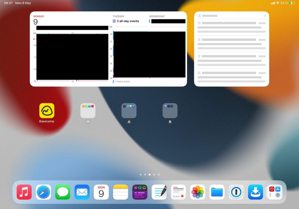
Widgets: Calendar app flavor of the month, Files, Timery, Mail, Reminders.
My work home screen is mostly tailored to the work we do in the Divide & Conquer agency. This home screen is mostly the business end of that work, as well as project management, with some apps for development and design, so it’s a bit loose like that. It’s not all-compassing, as the other home screens, so maybe I should divvy this one up a bit, too. Like I said, this is all a work in progress.
The streaming home screen
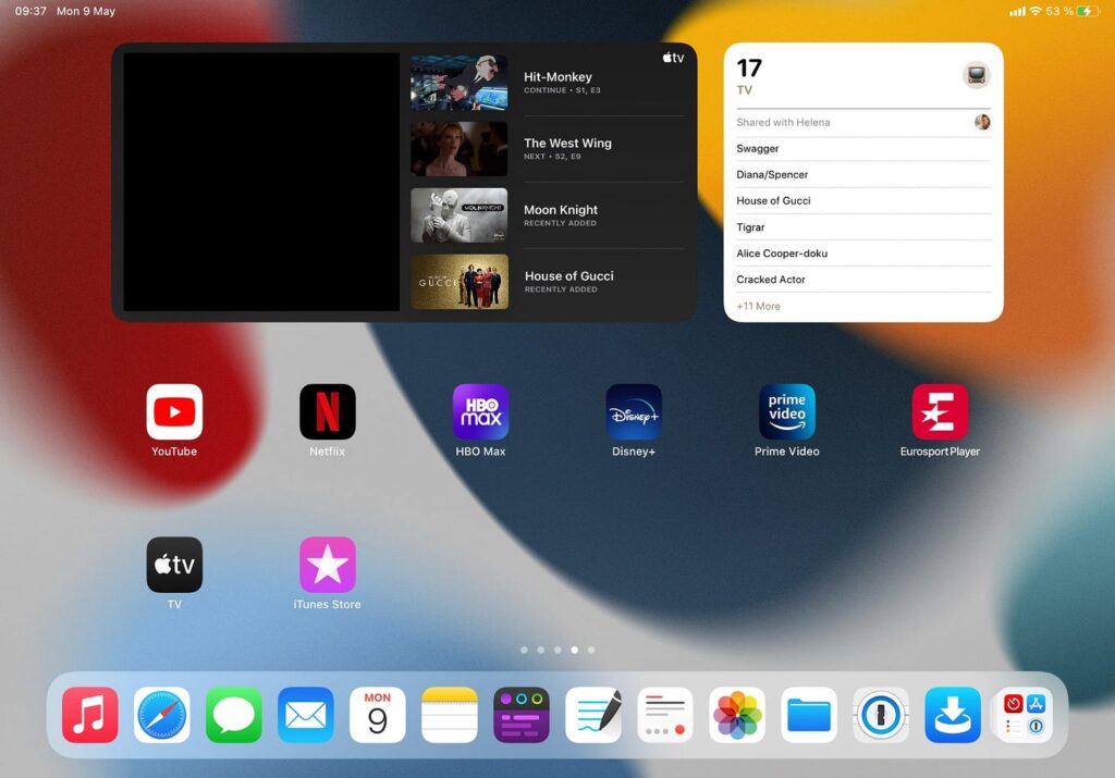
Widgets: TV, Reminders.
It’s been years and years since I cut the cord, but I certainly don’t save any money doing so. Streaming stuff goes here, basically, with the TV widget (get with the program, Netflix!), and a Reminders list/dumping ground for things my family’s been meaning to watch, but haven’t gotten around to yet.
The games home screen
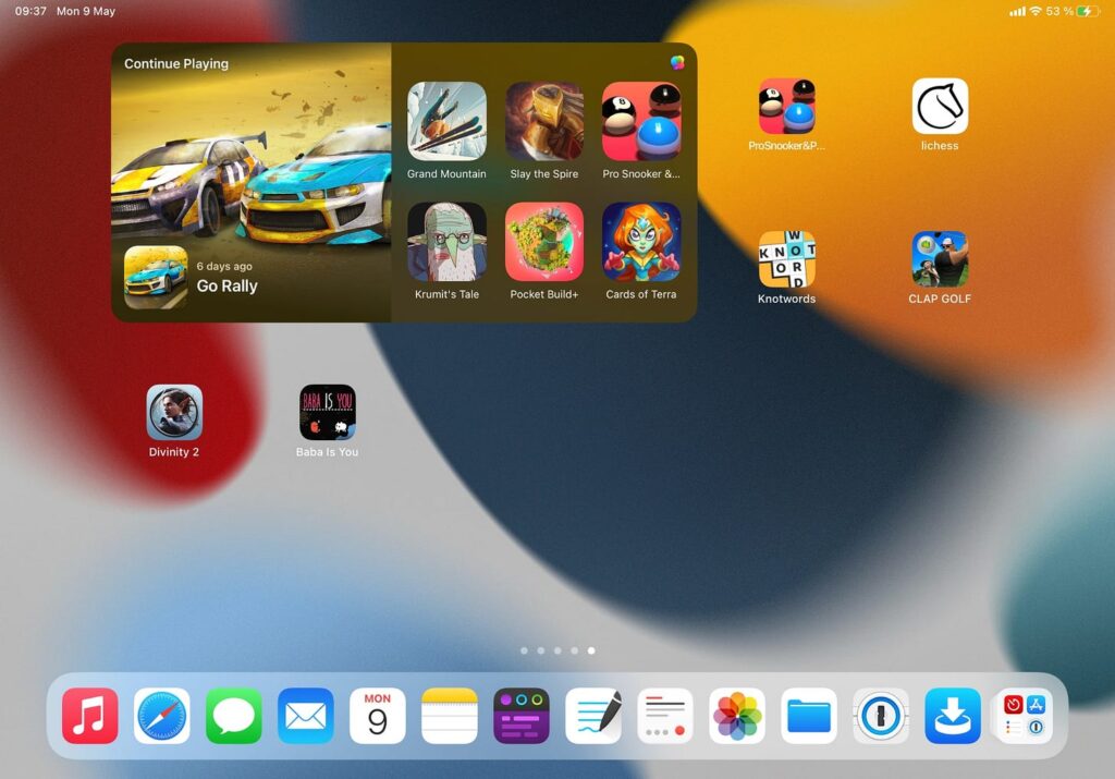
Widget: Game Center.
I download many games, but don’t get around to play as many as I’d like. The Game Center widget does a decent job reminding me what I’m playing. I also keep some games I don’t want to forget about, that don’t have Game Center, or that I’m playing currently on this screen. The rest of the games are in the App Library, obviously.
The idea behind this setup
My idea for this home screen setup was to tailor it to what I was about to do, without creating too many situations. For example, there are times when I focus on design, but it’s mostly connected to agency work, so I’m fine with it sitting there, despite it not always being the case. I’m trying to frame it after situation, and state of mind, which gets a bit muddy at times. Furthermore, it’s good to remember that you can open any app you want, even in Focus Mode, so not showing them, and hiding notifications, isn’t the same as blocking them completely.
Widgets clearly takes up some space on my home screens. I like a good widget, as you can tell, so I’m delighted to see app developers embracing them. And yes, I stack them a lot, and sometimes lets Siri decide what to show me. It’s hit-and-miss, but when it’s a hit, it’s pretty nice.
Speaking of home screens, how I wish they would sync across devices, optionally, of course. I’ve got multiple iPads, and while some are farther from each other’s in terms of usage, others are not. For example, I prefer my 12.9” M1 iPad Pro for dedicated design work, in apps like Affinity Designer. However, if that device isn’t available, but the 11” model is, then that works fine too. Or maybe I’ve got my beta iPad Pro, the one used to run iPadOS betas – then that overlaps in types of usage, whereas the iPad mini 6 doesn’t, at least not for me. So, I’ve got three iPads with similar potential usage, and thus it’d be great if I could sync home screens across them, but not with the iPad mini because I use it for other things. Since Focus Mode syncs, it wouldn’t be such a stretch to sync home screens too. Apps that aren’t available could be greyed out, like they are when you’re restoring a device from iCloud. Pretty please, Apple? Maybe in iPadOS 16, yeah?
💭 Read our hopes and dreams for iPadOS 16.
Focusing on home screens with Focus Mode
Now that we’ve got the home screens all set up, it’s up to Focus Mode to tie it all together. You don’t have to use Focus Mode, you could just swipe to the home screen you want and stay there, but we’re a procrastinating people, so whatever helps, right?
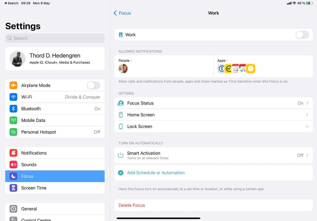
I’ve got a couple of Focuses set up, aside from the familiar Do Not Disturb and Driving one. This includes a tweaked Work (pictured above) and Personal mode. I currently have modes set to sync across devices (i.e., if I enable Work on my iPad, it’ll trigger on my iPhone, too). I’m uncertain if I like this or not, since home screens won’t sync, and when you throw a Mac in there, it gets a bit bumpy. I also have Smart Activation turned off because I move around too much for that, and my days aren’t as uniform for it to work, but I can see this being a great feature. I did use it before. A schedule or automation isn’t out of the question, though, especially to keep my writing habits. Whatever works for you, right?
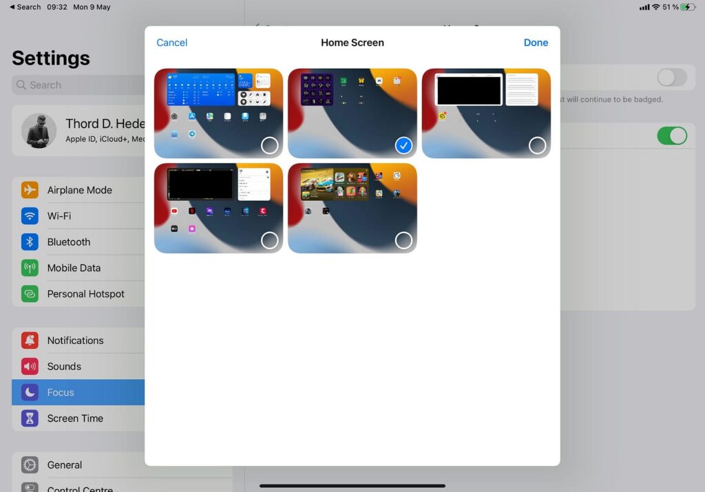
The most important setting for each Focus, however, is what home screen(s) it should show. Yes, limiting notifications and all that is great, too, but knowing that when I enable, say, the Create Focus Mode, I won’t be disturbed. Neither will I accidentally swipe to another home screen and get distracted – it’s just the relevant one there. Notifications are off, except for one person who gets to get through, and that’s it. That’s helping me to get, and stay, focused, right there.
That’s quite enough about home screens for a while. I know some of you will point out that I don’t have any shortcuts easily accessible, and that’s true, but it’s also a topic for another day. For now, take care.
