🆓 This member post is free for all, thanks to our paying subscribers. Enjoy!
Hi!
How are you? And more importantly, how and where are you reading these letters? I like to put longer pieces in a read it later service, something I’ve talked about before. I also like to use the default apps as much as possible, since they tend to integrate well with iPadOS.
So, where does that put Safari’s read it later alternative, called Reading List?
I ditched Pocket and its ilk for a couple of weeks, in favor of Reading List, and I have thoughts. Read on, or save for later, to find out if Safari’s Reading List is good enough.
The integration helps
All iPads ship with Safari, and the Reading List feature is a part of the web browser. It’s somewhat weird, to me, to open my web browser when I want to catch up on my reading. I tend to save articles from RSS feeds, Twitter, Reddit, and so on, which means that even though they’re always pieces on the web that I would like to read later, I’ve interacted with the link through an app that’s not Safari, ordinarily at least. The various read it later services rely on the share sheet to save an article, and it works well.

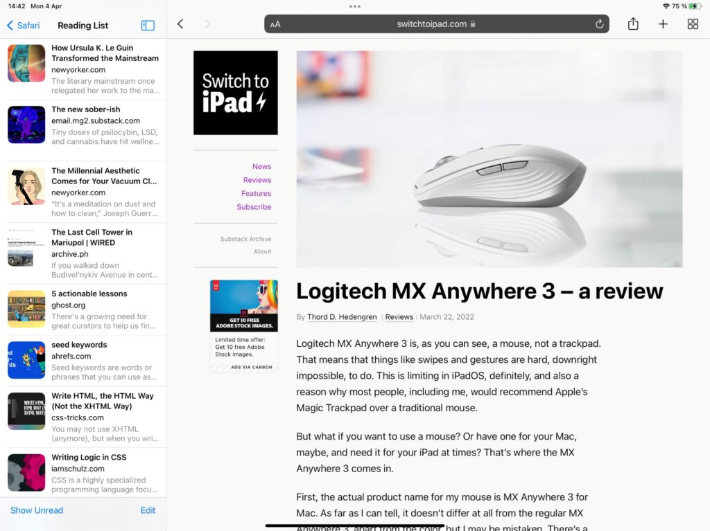
In comparison, the Safari Reading List lives in Safari. It’s tucked away in the left menu, meaning you’ll have to launch Safari, possibly toggle the menu pane, and tap Reading List to get to your saved articles. That’s quite a few taps compared to just launching Pocket.
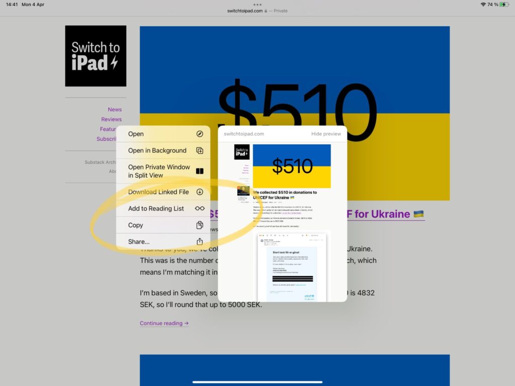
However, saving to the Reading List is just as easy, sometimes even more so, than the competing apps. Since Reading List is built-in from the get-go, it’s already sitting there, in the share sheet. It’s not an app icon, it’s one of those smaller ones underneath, which took me a moment to learn. That’s not the only way to share to the Reading List, though. If you long-press on a link, you’ll get the preview and a contextual menu, and saving to Reading List is there, too. This is outside the share sheet, so other apps can’t do this. I found that I enjoy this feature a lot.
The reading experience
Reading List is essentially a list of links to articles you’ve saved. There are no folders or tags or anything, like that, it’s just a list, so I’m sure there are plenty of power users (power readers?) that will skip this feature because of this. Likewise, if you’re the kind of person who does annotation in your saved articles, then Reading List isn’t for you. Apps that do this on web pages could help, but it’d be a different feature. With Reading List, you got your Show Unread and Show All views, and that’s about it.

Since the links are, well, links in the Reading List, you’ll open the saved article by default. One of the reasons I prefer read it later apps is that they all strap away ads and unnecessary noise. Reading List won’t do this, but Safari can, thanks to the Reader view. And I’ve got to tell you, while this view is limited compared to the settings available in, say, Pocket or Instapaper, it’s excellent. I like to think that Safari’s Reader view is better than Pocket when it comes to stripping out the unnecessary parts of an article. You’ve got some settings for font size and the like, but, again, it’s simple in comparison, but it works, it definitely does. Safari remembers your Reader view toggle, too, so there’s no need to toggle it at all times. When activated, you can navigate your Reading List by just scrolling up and down, too. I do that accidentally at times, but overall, it’s a nice feature, too.
I thought I’d miss Pocket, my read it later service of choice, for the reading experience, but that wasn’t it at all. No, my problem with Reading List is that it’s just a long list, I’ve got no way to properly sort it, and while I don’t annotate articles, I do tag them at times. If the saved articles were presented as a grid or something, getting to use the full screen and not just a small column, then things might’ve felt different, but this layout makes it cramped. I keep deleting articles I’ve read, which makes it a bit of a chore to maintain order in the Reading List.
It’s a close call
Look, it’s tempting to stay with Safari’s Reading List. The ease of which I can save articles to it, and the excellent Reader view, makes it a solid option for many. I save numerous articles, though, and would like a better overview.
It’s not back to Pocket though, not yet. I might see if I can get GoodLinks (reviewed here) to work with my reading workflow, as well as with my research. It’s not ideal for me, I think, to compare these two, but maybe I could. GoodLinks offer plenty of settings for the reading experience, so it might be a good choice. We’ll see.
But first I have to catch up on my Safari Reading List.
I keep questioning my apps, and giving default solutions an honest go. It’s interesting to see if old decisions still hold, challenge them, and find alternative solutions. Expect more thoughts on the matter in the future.
